Mobile-First Design: Why It Matters More Than Ever
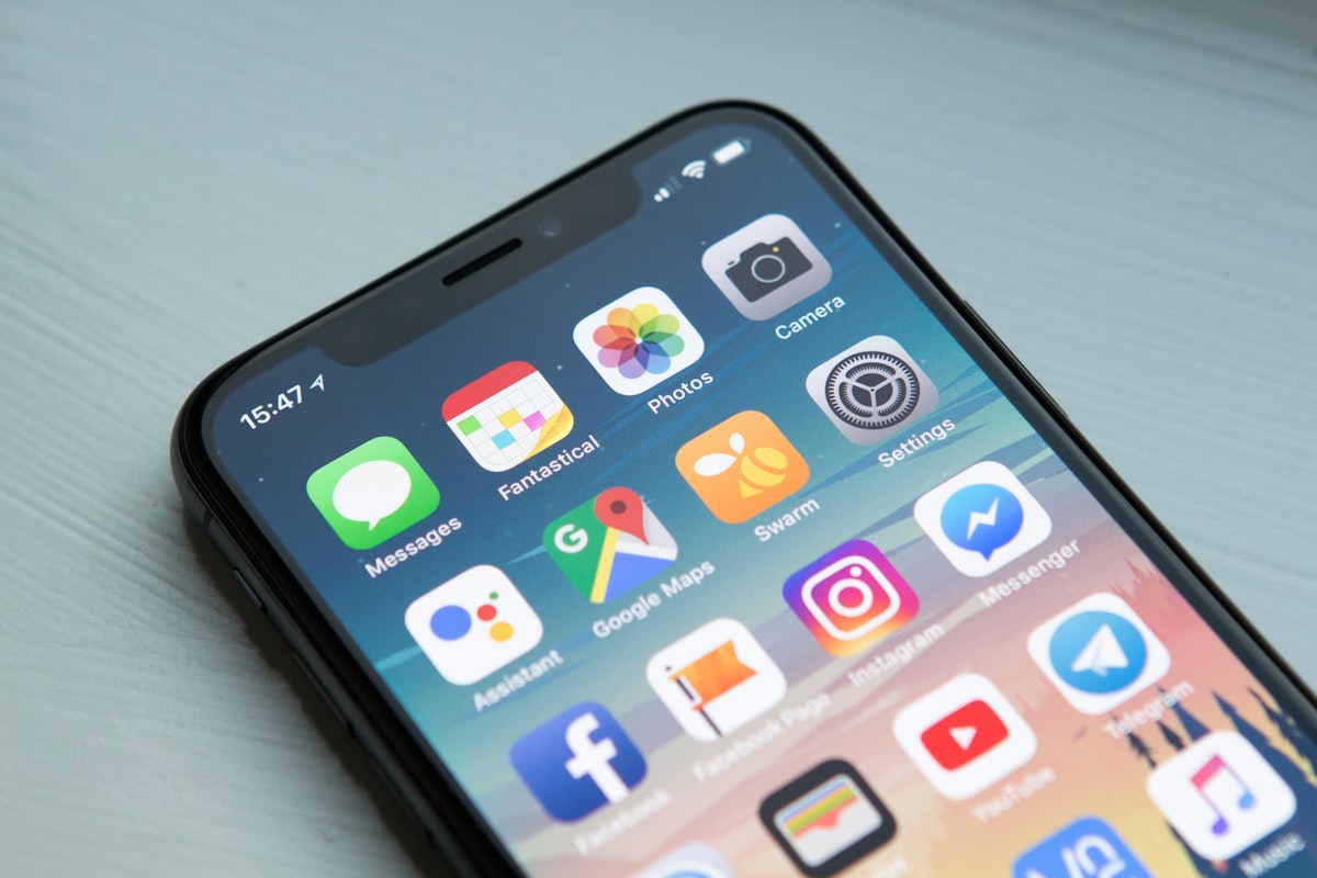
With over 60% of web traffic now coming from mobile devices, designing for mobile first isn't just a trend—it's a necessity.
What is Mobile-First Design?
Mobile-first design means starting with the mobile experience and progressively enhancing for larger screens. It's the opposite of the traditional desktop-down approach.
Why Mobile-First?
Performance Benefits
Mobile-first forces you to prioritize content and features, resulting in faster, leaner experiences across all devices.
Better User Experience
When you design for the most constrained environment first, you focus on what truly matters. This clarity benefits all users.
SEO Advantages
Google uses mobile-first indexing. Your mobile site's performance directly impacts your search rankings.
Key Principles
1. Content Prioritization
On a small screen, every pixel counts. Identify your users' primary goals and design around them.
Ready to put this into practice?
Get a free quote for your next design or development project.
2. Touch-Friendly Interactions
- Minimum touch target: 44x44 pixels
- Adequate spacing between interactive elements
- Consider thumb-friendly zones
3. Simplified Navigation
Hamburger menus, bottom navigation bars, and gesture-based interactions work well on mobile.
4. Optimized Images
Use responsive images and modern formats like WebP. Consider lazy loading for better performance.
Common Mistakes to Avoid
- Hidden content: Don't hide important content in collapsed menus
- Tiny text: Keep body text at least 16px
- Slow loading: Optimize, optimize, optimize
- Desktop thinking: Don't just shrink your desktop design
Implementation Strategy
/* Mobile-first CSS approach */
.container {
  width: 100%;
  padding: 1rem;
}

/* Tablet and up */
@media (min-width: 768px) {
  .container {
    max-width: 720px;
    margin: 0 auto;
  }
}

/* Desktop and up */
@media (min-width: 1024px) {
  .container {
    max-width: 960px;
  }
}
Testing is Critical
Test on real devices, not just browser dev tools. Different devices have different behaviors, performance characteristics, and user expectations.